Most of the really interesting things I work on / or useful packages I stumble across I cant usually share as they’re linked to my job. Nevertheless, this exercise was 100% personal - basically, I wanted to have a look at a few different topics (namely Plotly & native SQL calls in Python) so decided to wrap it into this mini-project. Personally, I always like approaching new tech / packages like this - either by finding a problem at work to potentially solve, or just mixing some topics for my own interest. Nothing helps me learn quite like actually applying it to a problem / goal. If you’re interested you can find my code and datasets here on GitHub.

Exploring Weather Trends
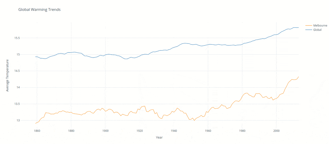
The below analysis was created to compare local and global temperature data sets and the temperature trends between Melbournne Australia to the overall global temperature trends.
Approach
Two data sets (global monthly temperatures and local yearly temperatures) were imported via Python and transfered into a local SQL database1. SQL queries were created to extract the temperatures related to the city of Melbourne and globally between the years of 1820 - 2013.
The following queries were created to extract the global and local data from the SQL databases respecitvly:
SELECT *
FROM global_data
WHERE dt BETWEEN "1820-01-01" AND "2013-12-01";
SELECT *
FROM city_data
WHERE city = "Melbourne" AND year BETWEEN "1850" AND "2013"
With the data extracted it was imported into a Python dataframe and filtered to begin on the first year both land and ocean average temperatures were avaialble2. A ten year moving average was applied to both data frames (with the following code) to ensure the charts were smoothed to make for a result which was visually easy to compare abnd intepret.
df['avg_temp'].rolling(window=10).mean()
Finally the results were charted into a plotly line chart within Python. The predominant selection creiteria was based on the fact of having the option of dynamic feedback / filterting. After the preliminary analysis of the results it was clear there was an increasing trend in the last years. Enabling a dynamic chart would allow users to investigate further in a simple manner.
import pandas as pd
import sqlite3
import chart_studio.plotly as py
import cufflinks as cf
# Set closest city variable
city_var = 'Melbourne'

# Import datasets
city = pd.read_csv('data/city_data.csv')
world = pd.read_csv('data/global_data.csv')

# Create SQL database
conn = sqlite3.connect('data/weather.db')

# Transfer CSV to SQL
city.to_sql('city_data', conn)
world.to_sql('global_data', conn)
# SQL queries from global database into dataframes
sql_global_string = 'SELECT * FROM global_data WHERE dt BETWEEN "1820-01-01" AND "2013-12-01";'
world = pd.read_sql(sql_global_string, conn)

# Checking first year land & ocean data was available
year_filter = world["LandAndOceanAverageTemperature"].first_valid_index()

# Filter dataset accordingly
world = world.iloc[year_filter:]

# Rename ugly column title
world = world.rename(columns={'LandAndOceanAverageTemperature':'avg_global_temp'})

# Filtered and avereaged to yearly values to compare with city data set
world['year'] = pd.DatetimeIndex(world['dt']).year
world = world.groupby('year')['avg_global_temp'].agg('mean')
world = world.reset_index()
world['rolling_global_temp'] = world['avg_global_temp'].rolling(window=10).mean()
# SQL queries from city database into dataframes
sql_city_string = 'SELECT * FROM city_data WHERE city = "%s" AND year BETWEEN "1850" AND "2013"' % city_var
city = pd.read_sql(sql_city_string, conn)
city['rolling_temp'] = city['avg_temp'].rolling(window=10).mean()
# Merge datasets into one for charts
temps = pd.merge(world, city, on='year')
temps = temps.rename(columns={'rolling_global_temp':'Global','rolling_temp':city_var})

# Plotting global warming charts
cf.go_offline()
temps.iplot(kind="line", theme="white",
            x ='year', y =[city_var, 'Global'],
            title="Global Warming Trends", xTitle='Year', yTitle='Average Temperature')
 ⚠️ UPDATE: Unfortunately Plotly Chart Studio has been retired so the interactive charts are now no longer possible - heres an animation at least showing the original charts / concept.
# Last 50 years summary
summary = temps.loc[temps['year'].isin(['1960','2010'])]
summary = summary.set_index('year')
summary = (summary[['Global',city_var]]).round(1)
summary.loc['Delta'] = (((summary.iloc[1] / summary.iloc[0])-1)*100)
summary.loc['Delta'] = summary.loc['Delta'].map('{:,.1f}%'.format)
summary
Observations / Findings
Over the last 50 years of the dataset (1960 - 2010) we have seen globally there was a 3.3% increase, this compared to 2.7% the 50 before that (1910 - 1960). Interestingly enough Melbourne faced a 7.6% increase compared to 0.0% the 50 before.
Although Melbourne is approximatley 4.3% higher then the global average in the same time span its growing at a significantly higher rate (7%) then the world average when measured over the past 100 years.
Its clear that the data inidcates the world is getting significantly hotter, of significant concern though is that the fastest growing city in Australia (the dryest continent on earth3) is increasing in temperature well above and beyond the global norm.
Footnotes
[1] The conversion of the tables into a SQL database and queried back into a dataframe was simply to keep consistent with the goal of the project. This was obviously not the most efficient solution.
[2] Average land and ocean temperatures for the analysis was selected simply as its been shown this is a more accurate global measure.